2. Simple Line Plots
2025. 6. 19. 23:04ㆍPython/Matplotlib
- We will start by setting up the notebook for plotting and importing the packages we will use
# In[1]
%matplotlib  inline
import matplotlib.pyplot as plt
plt.style.use('seaborn-whitegrid')
import numpy as np- For all Matplotlib plots, we start by creating a figure and axes.
# In[2]
fig=plt.figure()
ax=plt.axes()
- In Matplotlib, the figure can be thought of as a single container that contains all the objects representing axes, graphics, text, and labels.
- The axes is what we see above: a bounding box with ticks, grids, and labels, which will eventually contain the plot elements that make up our visualization
- Once we have created an axes, we can use the
ax.plotmethod to plot some data.
# In[3]
fig=plt.figure()
ax=plt.axes()

x=np.linspace(0,10,100)
ax.plot(x,np.sin(x));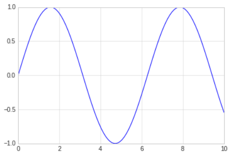
- The semicolon at the end of the last line is intentional: it suppresses(숨기다, 참다) the textual representation of the plot from the output.
- We can use the Pylab interface and let the figure and axes be created for us in the background; the result is the same
# In[4]
plt.plot(x,np.sin(x))
- If we want to create a single figure with multiple lines, we can simply call the
plotfunction multiple times.
# In[5]
plt.plot(x,np.sin(x))
plt.plot(x,np.cos(x))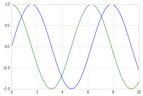
Adjusting the Plot: Line Colors and Styles
- The
plt.plotfunction takes additional arguments that can be used to specify the line colors and styles. - To adjust the color, you can use the
colorkeyword, which accpets a string argument representing virtually any imaginable color.
# In[6]
plt.plot(x,np.sin(x-0), color='blue')        # specify color by name
plt.plot(x,np.sin(x-1), color='g')           # short color code(rgbmyk)
plt.plot(x,np.sin(x-2), color='0.75')        # grayscale between 0 and 1
plt.plot(x,np.sin(x-3), color='#FFDD44')     # hex code(RRGGBB, 00 to FF)
plt.plot(x,np.sin(x-4), color=(1.0,0.2,0.3)) # RGB tuple, values 0 to 1
plt.plot(x,np.sin(x-5), color='chartreuse')  # HTML color names supported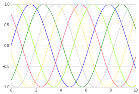
- If no color is specified, Matplotlib will automatically cycle through a set of default colors for multiple lines.
- The line style can be adjusting using the
linestylekeyword.
# In[7]
plt.plot(x,x+0, linestyle='solid')
plt.plot(x,x+1, linestyle='dashed')
plt.plot(x,x+2, linestyle='dashdot')
plt.plot(x,x+3, linestyle='dotted')

# For short, you can use the following codes
plt.plot(x,x+4, linestyle='-')
plt.plot(x,x+5, linestyle='--')
plt.plot(x,x+6, linestyle='-.')
plt.plot(x,x+7, linestyle=':')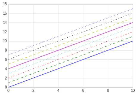
- Though it may be less clear to someone reading your code, you can save some key-strokes by combining these
linestyleandcolorcodes into a single non-keyword argument to theplt.plotfunction.
# In[8]
plt.plot(x,x+0,'-g')  # solid green
plt.plot(x,x+1,'--c') # dashen cyan
plt.plot(x,x+2,'-.k') # dashdot black
plt.plot(x,x+3,':r')  # dotted red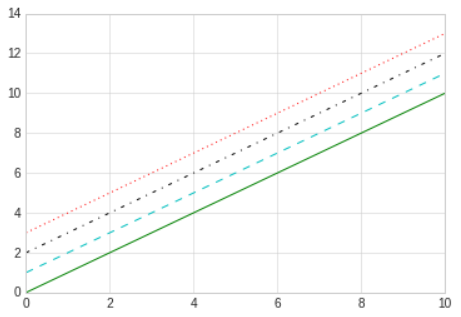
- These single-character color codes reflect the standard abbreviations in the RGB and CMYK color system, commonly used for digital color graphics.
Adjusting the Plot: Axes Limits
- Matplotlib does a decent job of choosing default axes limits for your plot, but sometimes it's nice to have finer control.
- The most basic way to adjust the limits is to use the
plt.xlimandplt.yilmfunctions.
# In[9]
plt.plot(x,np.sin(x))

plt.xlim(-1,11)
plt.ylim(-1.5,1.5);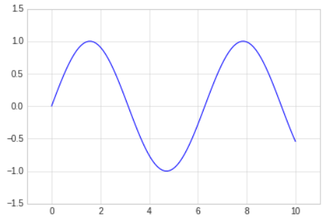
- If for some reason you'd like either axis to be displayed in reverse, you can simply reverse the order of the arguments.
# In[10]
plt.plot(x,np.sin(x))

plt.xlim(10,0)
plt.ylim(1.2,-1.2);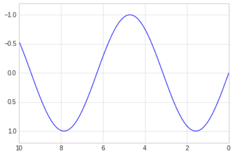
- A useful related method is
plt.axis, which allows more qualitative specifications of axis limits.
# In[11]
plt.plot(x,np.sin(x))
plt.axis('tight');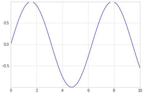
- Or you can specify that you want an equal axis ratio, such that one unit in
xis visually equivalent to one unit iny.
# In[12]
plt.plot(x,np.sin(x))
plt.axis('equal');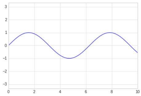
- Other axis options include
on,off,square,image, and more. For more information on these, refer to the plt.axis documentation
Labeling Plots
- Titles and axis labels are the simplest such labels-there are methods that can be used to quickly set them.
# In[13]
plt.plot(x,np.sin(x))
plt.title("A Sine Curve")
plt.xlabel("x")
plt.ylabel("sin(x)");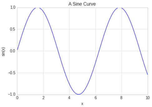
- The position, size, and style of these labels can be adjusted using optional arguments to the functions, described in the docstrings.
- When multiple lines are being shown within a single axes, it can be useful to create a plot legend that labels each line type.
- Matplotlib has a bulit-in way of quickly creating such a legend; it is done via the
plt.legendmethod.
# In[14]
plt.plot(x,np.sin(x),'-g',label='sin(x)')
plt.plot(x,np.cos(x),':b',label='cos(x)')
plt.axis('equal')

plt.legend();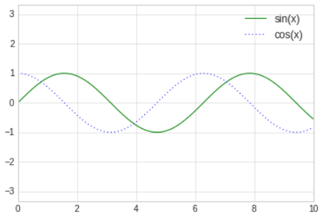
- The
plt.legendfunction keeps track of the line style and color, and matches these with the correct label.
For more information about plt.legend, refer to this url :
plt.legend documentation
Matplotlib Gotchas
- While most
pltfunctions translate directly toaxmethods, this is not the case for all commands. - In particular, functions to set limits, labels, and titles are slightly modified.
- For transitioning between MATLAB-style functions and object-oriented methods, make the following changes.
plt.xlabel=>ax.set_xlabelplt.ylabel=>ax.set_ylabelplt.xlim=>ax.set_xlimplt.ylim=>ax.set_ylimplt.title=>ax.set_title- If the object-oriented interface to plotting, rather than calling these functions individually, it is often more convenient to use the
ax.setmethod to set all these properties at once.
# In[15]
ax=plt.axes()
ax.plot(x,np.sin(x))
ax.set(xlim=(0,10),ylim=(-2,2),
xlabel='x',ylabel='sin(x)',
title='A simple plot');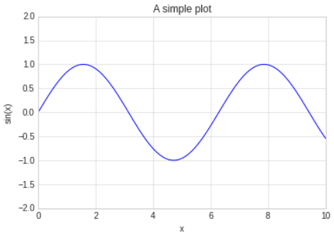
'Python > Matplotlib' 카테고리의 다른 글
| 6. Customizing Colorbars (0) | 2025.06.20 |
|---|---|
| 5. Customizing Plot Legends (0) | 2025.06.20 |
| 4. Density and Contour Plots (0) | 2025.06.19 |
| 3. Simple Scatter Plots (0) | 2025.06.19 |
| 1. General Matplotlib Tips (0) | 2025.06.19 |